Insight
4 Surefire Ways to Design 100% Readable Signage

The case, color, font, and size of lettering can make all the difference.
The legibility and readability of written text and printed characters are fundamental to designing signage that works. While there are building code requirements and accessibility standards in signage design, these guidelines can vary by country and further by city. Even the best practices typically only consider the extremes of human conditions, like complete blindness. Think of the mandatory inclusion of braille on most signs when only 7% of those who are legally blind read braille. 65% of the world’s population has imperfect vision. There’s a 2 in 3 chance that you are using corrective lenses to read this right now. So, how is signage designed for “the majority” or “the norm”? What about those who are color blind or neurodivergent with difficulties like dyslexia?
Here, we’ve asked the brandx-perts, HLW’s in-house signage, wayfinding, and brand experience team, for four surefire tips on how to make signage more legible and inclusive.
Use Both Title and Sentence Case
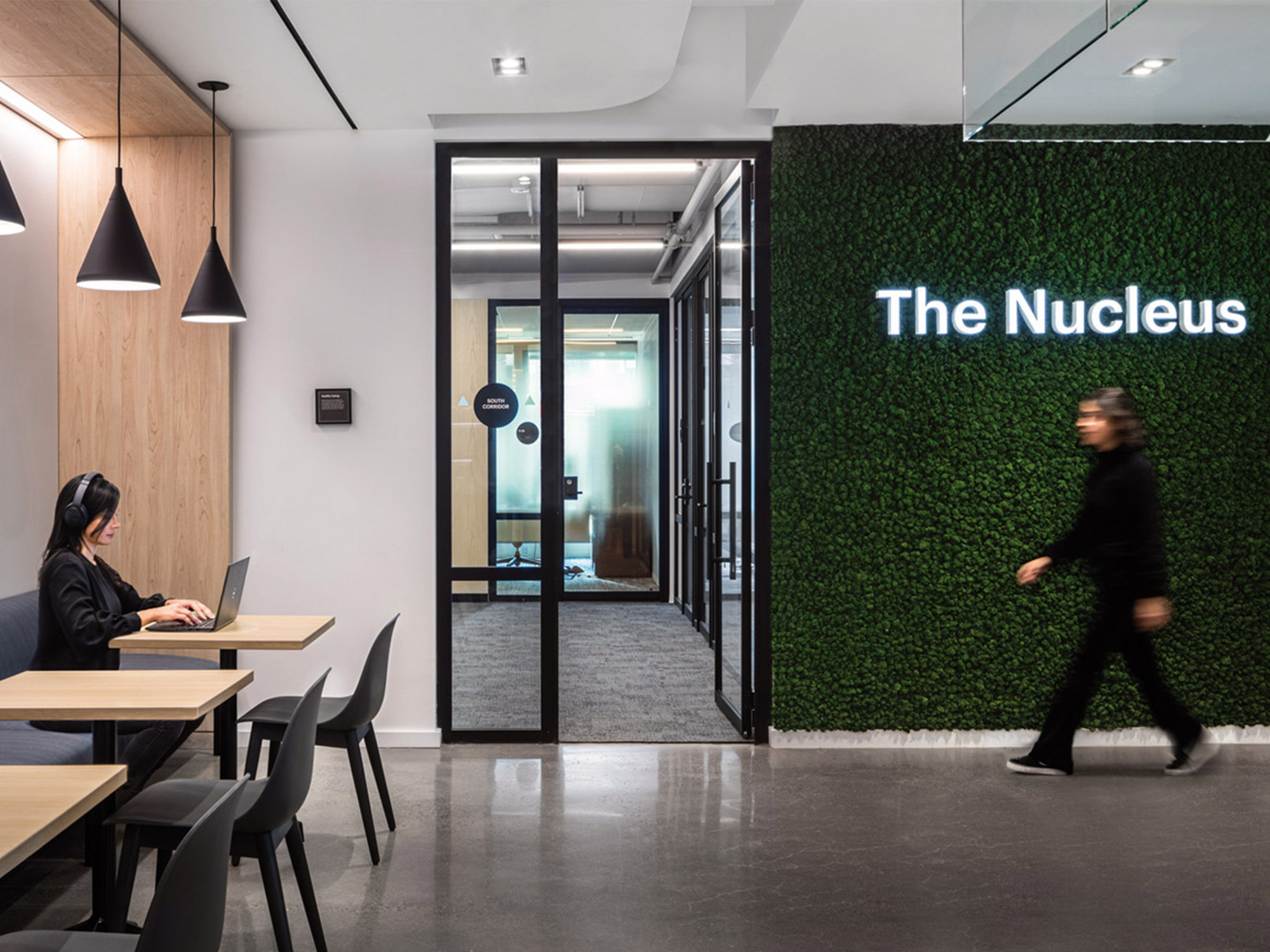
A lot of signage in the United States, especially room identification, is written in all caps due to building codes. This varies from other countries, such as Canada, Mexico, France, Poland, UK, and Egypt—regions where we have experience—where the requirement is for text to be in title case.
Over the last decade, studies have shown that title case—where the first letter of each word is capitalized—and sentence case— where the first letter of each sentence and proper nouns are capitalized—is much easier to read. Why? Capital letters look too similar to each other, making multiple all-caps words harder to distinguish.
In fact, even if text is garbled, like in the below example, your brain can still read the sentence so long as the first and last letters are in the correct case and order (click here to learn more):
Tihs is bceusae our birans dno’t ntuarlaly sonud out ecah lteter wehn raednig, raethr tehy look at the “pcitrue” of the cmolpete, fmailiar wrod.
Due to this efficiency of communication, we like to use title or sentence case where and when we can. This applies to signs not mandated to be tactile, such as wayfinding, directories, blade signs, and those displaying values or mission statements.
Bump Up Color Contrast

A tone-on-tone sign might look elegant, but for the colorblind and visually impaired it can be illegible. Most U.S. state and city building codes require a 70% color contrast, which relates to shade, tone, hue, and tint. brandx recommends exceeding that minimum where possible. Some ways to do this include researching the Light Reflectance Value (LRV) of the background and text colors or utilizing a free, web-based application to determine the contrast. Choosing black and white is also an assured way to make your signage legible.
Mix It Up with Serif or Sans Serif Fonts

Choosing between a serif and sans serif font has a huge impact on the legibility of your signage.
As a go-to, brandx recommends selecting a serif font when dealing with smaller text and longer paragraphs of information. Their design improves kerning and word recognition, which helps people speed read.
Sans serif is the best choice for larger text, less text, or text read at high speeds (like on the highway). The extra ticks or lines on serif fonts make it harder for your brain to read on the move because it’s more to process, but when text is more compact (like in a novel), serif fonts are easier to read because the ticks create an ideal space between letters (kerning) in words.
ADA and US building codes mandate sans serif fonts for signs that identify permanent rooms and spaces due to their clear readability at a distance or at high speeds, which helps both neurotypical and neurodivergent individuals navigate.
The right mixture of serif and sans serif fonts, similar to what you experience in your day-to-day life, is ideal for successful signage and wayfinding systems.
Here is some more information on serif vs. sans serif readability that’s influenced our designs.
Go Big, Go Bold

When in doubt, increase the text size, as larger text is easier to read. If enlarging the text isn’t an option, a heavier font weight may do the trick, especially if it’s a lighter text color on a darker background. Why? When you have white text on a black or dark background, an optical illusion occurs that tricks your eye into seeing the dark background bleeding into the light text. This actually does occur with printing, because the white is often the absence of ink, and the dark will sometimes bleed into the blank areas. Suddenly, the same font weight seems lighter and harder to read. In cases like these, keep that legibility consistent by going big and bold.
With advancements in neuroscience and our daily exposure to signage and wayfinding, legibility will always be a study of interest for brandx. It’s not only about staying current; it’s about pushing boundaries to design signage that’s as dynamic and diverse as the world around us. Some final tips for brandxcellence: trust your instincts, don’t be afraid to make mistakes (we certainly have), and be critical of the signage you use every day.